PALM DESERT, CA – An Abercrombie & Fitch executive at eTail West 2016 discussed how the millennial-friendly retailer revamped its mobile application and site with commerce-first tactics, such as using color to drive urgency and implementing add-to-bag calls-to-action.
During the keynote session, “Delivering The Right Product To The Right Customer Using Mobile Personalization,” the executive highlighted ways for other retailers to bolster their mobile sales, which included engaging in A/B testing, serving different site or app versions to segmented audiences and using colors proven to drive urgent responses. Abercrombie & Fitch has upped the ante for brands serving younger customers by recently implementing a slew of mobile-first changes that keep the customer experience front-of-mind.
“Mobile customers are more time-pressed,” said Anshuman Tenaja, senior director and head of digital product management at Abercrombie & Fitch.
Small-screen optimization
The process of browsing on a smaller screen requires retailers to elevate what is most important, enabling consumers to have a more streamlined experience. Abercrombie & Fitch overcame this challenge by testing details for lead product images and determining which outfit combinations and image angles best showcase the item in question.
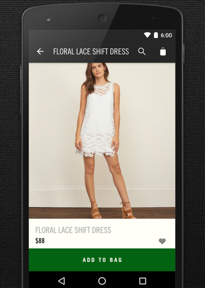
Calls-to-action are also paramount for the apparel retailer. This prompted Abercrombie & Fitch to bring add-to-bag options to the forefront of its app and mobile site. Consumers who tap on a product to examine it in greater detail will spot a large “add to bag” button emblazoned across the bottom of the screen, a tactic which the executive recommended other marketers employ.
“You’re not really doing this for the high-intense shoppers,” Mr. Tenaja said. “You’re doing this for the 1 to 2 percent that need that subconscious push.”

A&F keeps its purchasing calls-to-action front-and-center in the app
Additionally, Hollister, which is owned by Abercrombie & Fitch, revamped the way that shoppers save favorite items. Instead of being forced to click on a product and visit its corresponding page to choose a size and place it in the virtual shopping bag, users can now view all items in a poster format on one page, and favorite them with the tap of a finger.
This allows visitors to accumulate several products in their shopping carts, and go back at a more convenient time to decide which ones they will purchase and which they will delete.
This is a strategy that culminates in “mobile snacking,” the process of browsing or purchasing on smartphone in small bursts of time.
“If users want to snack, let them snack,” Mr. Tenaja said. “If you let them snack, you do want to close the sale at some point and one way to do that is to sync all devices.”
The color factor
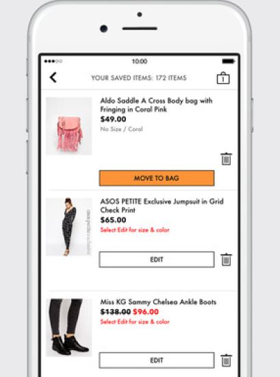
Another way of driving mobile purchases is to leverage congruent colors that promote immediate decision-making. Orange is one color that conveys urgency and time crunch on mobile, suggesting that retailers should ensure they have an orange button or call-to-action visible on their checkout pages.
“If you create congruency between the colors you use and the mindset of the customer, you’re more likely to get a favorable outcome,” Mr. Tenaja said.

ASOS is one retailer that uses orange buttons to drive urgency
Context-aware and schedule-aware apps are also useful tools for retailers with large bricks-and-mortar footprints. For example, the Walgreens app can customize homepage content when a user walks in-store.
Schedule-aware apps can offer a new level of timeliness when it comes to messaging.
Furthermore, A/B testing is a must-have tactic for brands. The true magic comes from segmenting results and pinpointing which segments or app versions work for each audience. Then, marketers should deliver those versions to their respective best-match segments.
“When you look at what to optimize on mobile app and Web, test a lot, segment your test results and build a personalization strategy from that,” Mr. Tenaja said.
Read the original post at Mobilecommercedaily.com
